Those are all terrible, they are all making the ridiculously incorrect assumption that it is confusing. It's possibly the only site that my Luddite family can make full use of, without ever having asked me for help.
The designs that change the layout make it less usable by preventing you from seeing everything it has to offer on one spectacularly ugly, usable page.
The design that kept mostly everything the same but modernized the colors, fonts and spacing is still worse that the current site: the current site has an effect of the design dissappearing behind the content, and the redesign has the colors and highlights push past the links and draw my attention away.
I disagree. A few were bad, but in my opinion the one by the New York Times designer was a usability improvement, while still keeping things simple. The layout was practically identical.
I think the problem you're experiencing is that craigslist is practically defined by its crappy design. Paradoxically, making craigslist better looking makes it less like craigslist. Every popular website experiences this kind of backlash when it is redesigned, because people get used to it the way it is, and don't want to re-learn what they already know.
I'm not experiencing any problem. The NY Times design is a disaster. It banishes the useful events feature to the most obscure part of the page, while giving tons of space to a feature that would only be used by the tiniest fraction of the users. Most users don't have an account and will not take advantage of that feature.
I'm not married to the bad design, and I don't think that a better design would inherently decrease usability; but these specific ones do, and the current design is usable. Uglyness doesn't necessarily mean poor usability.
"The NY Times design is a disaster. It banishes the useful events feature to the most obscure part of the page, while giving tons of space to a feature that would only be used by the tiniest fraction of the users."
I think you're exaggerating. The NYT designer's redesign is extremely similar to the existing layout, with perhaps a bit more spacing and better colors. You may not like it, but it's a stretch to call it a "disaster".
When I said you have a problem, I wasn't trying to imply that you're irrational or confused. I just think you have an opinion that's rooted intensely in the way that you use the site (totally understandable), and you're trying to generalize that opinion to everyone. For example, I've never used the events feature that you find so important, and before I saw the NYT design I had no idea that you could create an account. If I didn't know it, maybe there are millions of other people who don't know about it either -- a good reason why the feature might be under-utilized.
> For example, I've never used the events feature that you find so important, and before I saw the NYT design I had no idea that you could create an account. If I didn't know it, maybe there are millions of other people who don't know about it either -- a good reason why the feature might be under-utilized.
And that proves my point. The NY Times redesign dedicates lots of space to a new feature that relies on a feature that no one uses. Craigslist is designed specifically to be anonymous to the point where you don't require an account. Putting something that personalizes an account goes against one of the things that made them popular in the first place.
This reply shows that you are posting on the redesign without doing any research. I don't use the events feature, but if you bothered to do any research before commenting then you would see that it is quite popular.
The most cursory research on what the posts are will tell you that most people use the site to get/get rid of something (e.g., jobs, items, sex), or for the community features.
A design that requires marginalizes one of these things to the least visible location is a disaster.
"This reply shows that you are posting on the redesign without doing any research. I don't use the events feature, but if you bothered to do any research before commenting then you would see that it is quite popular."
Why do you have to take such a hostile tone? I'm not attacking you. This isn't an argument that can be won or lost.
That said, I still think you're exaggerating your case -- the redesign puts the event calendar on every page on the site, as opposed to the current design, where it only appears on a few pages. It may not be as prominent as you think it should be, but that's fairly subjective. Calling the design a "disaster" is a stretch.
The bottom line is that neither one of us knows the practical implications of the redesign, nor could we, without doing usability testing. It's a matter of opinion.
That's interesting, I have a totally different experience with the site. The animated ad for the Sunday magazine totally dominates my glance at the page. My eye is drawn along the horizontal and vertical rules to ads in blue, yellow, red. I don't immediately see "Top Stories" or "Sections"; I see the flash ad, then "IN SUNDAY'S TIMES", then a tab-headered table labeled "MEN'S 3RD ROUND|WOMEN'S 4TH ROUND".
The sfgate.com website strikes a different balance that's seems further from its respective printed paper. It's similarly strewn with ads and blinkies, but they don't seem as jarring to me, it feels like a website while the nytimes feels like "the website of the newpaper".
Wait, people actually use that events calendar on Craigslist? I've only seen people mistake it for personals and use it for advertising crap.
I agree that the New York Times designer's version is a big improvement. A few things that really bug me about the current version that are fixed with this design include the left aligned headers / fixed page flow, more obvious search box, and fixed colors. In my opinion if you're going to use default browser link colors you should be using the default browser background color. Maybe that just bothers me though, who knows, I'm weird. Also, why do we need to see a list of countries / states / anything besides local cities? How is that not just more useless clutter?
They do reference the Wired article. I really don't see anything wrong with it. It's a design blog, so it's understandable. If I were interested in design, that part of the article would be the most relevant to my interests, and so there'd be no need to go through the 3+ pages on Wired to get to it if someone has done the work for me (which seems to be appropriately cited).
I was speaking more to the relevancy of the original Wired article and this post to an audience of designers, and idsgn readers more specifically, not to us here. But yes, this is a reposting to us, so it's not needed.
This article confirms a number of things to me, all of which I already believed:
1. pure designers are not good at useful web apps (Studio8), 2. the NYTimes people couldn't design their way out of a paper bag
3. the BarackObama.com guy is a freaking genius of usability
Some people here love the NYTimes version but I really think it devotes a ton of space to features nobody really uses in an effort to force people to use them more -- something the NYTimes itself does. Of course, I hate the design of NYTimes.com itself, so maybe I'm biased.
SimpleScott's design simply reinforces existing usage patterns, and for that reason I like it best.
The NYTimes example is by Khoi Vinh (http://www.subtraction.com/). He's certainly no design slouch, particularly when it comes to grid based layouts.
NYTimes is an enormously complex site. Given the ridiculous number of priorities they have to juggle, and number of people they have to please, I think they do an admirable job. The site has to balance looking like a historic newspaper with the constraints of the web.
> The site has to balance looking like a historic newspaper with the constraints of the web.
See, that's certainly what they're trying to do, but I have absolutely no idea why they think "look like a newspaper" is one of their key constraints. You're a website: look like a website. The reason people don't read newspapers anymore is because they're inconvenient, why on earth would try to emulate a dying format?
One thing that seems to have been missed is that the Craigslist design is part of their business model - it results in pages that are very small and keeps their bandwidth costs down, enabling them to offer free listings.
Not a great example as fewer people are using the phone book every year in favor of sites like YellowPages.com that look a lot more like what the "after" designs in this article were.
I can only speak for people I know, but as far as I can tell the phone book is being replaced by (a) cell phones, which until the iPhone mostly had horrible UI design and (b) Google, which goes barely beyond Craigslist in the visual design department. I don't know anyone who uses YellowPages.com. (According to Alexa its reach is 0.1%.)
"Don't make something unless it's both necessary and useful; But if it's both necessary and useful, don't hesitate to make it beautiful." - Shaker Dictum.
It's entirely possible that Craigslist is successful on account of its ugliness. It's also entirely possible that it's successful in spite of its ugliness. I'm inclined to believe the latter.
Aesthetics are extremely important. One can certainly succeed without beautiful design, but more beautiful products are perceived to be more useable.
On the one hand, the right designer could significantly improve the look and feel of Craigslist, without affecting it's structure: a carefully applied colour scheme, better typography, whitespace and a fine attention to detail would help.
On the other hand, Craigslist is the mother of all outliers. Everything they do seems totally counter-intuitive.
Is there room for improvement? Definitely. Should it be improved? It's worthy of a debate.
The problem with craigslist isn't the graphic design. It's functional and clear.
The problem is that useful data isn't required and available. For instance, partment listings should require at least cross streets, so that it's possible to search geographically. Computer parts should be split into component (laptop, monitor, cpu, keyboard, etc).
Craigslist is based around location, so every listing should have at least some rough neighborhood geolocation.
A little customization by category would render the site much more usable, while changing nothing that would be confusing to users.
Having more property-based forms on data-heavy posts (e.g. when selling computers) would be nice. It's very frustrating when someone leaves off something in the plaintext description that would be a required field if it was separated.
You mean, automatically block all-uppercase posts. Let the people figure it out for themselves, don't let them think that "computers just do that" so that they start sending e-mails that way.
> 1. Automatic spelling correction from posting-lingo in Standard English.
> 2. Automatic stemming of arbitrary description of location into zipcode.
One hallmark of Craigslist is that they do not care one shred about what you post, as long as it doesn't violate the liberal terms of service. Drop by your local RnR if you think that all-caps is anywhere near the most egregious abuses of content freedom on the site.
> 3. Avoid scams by something like reputation points.
I'm confident that the majority of content on Craigslist is submitted by anonymous users.
I like one or two designs, but I can't say that any of them is "better". It's easy for designers to pop Photoshop open and start moving things around to provide a final "web 2.0" layout or a "more beautiful" look and feel, without looking at analytics and studying user behavior.
CraigsList is useful, but not very usable. And sometimes a useful product with low usability score is better than a usable product, that 50M existing users need to re-learn. Muscle memory plays an important role for existing customers, especially frequent visitors.
Craigslist is a profitable business. And they need to evolve incrementally the same way Amazon does.
The fact that it's simple and basic doesn't mean that it's broken. It works. At least 95% of the time :)
No matter how the site is re-designed, people will hate it. This is simply because people hate change.
The NYT team (for example) could test their deign and produce empirical evidence that their design (with tweaks from testing, of course) is better, faster, and generally more usable in every task for every kind of user---and long-term Craigslist users will still hate it, claim it's unusable, unintuitive, and is confusing.
1. This approach likely pentuples bandwidth, and that's optimistic.
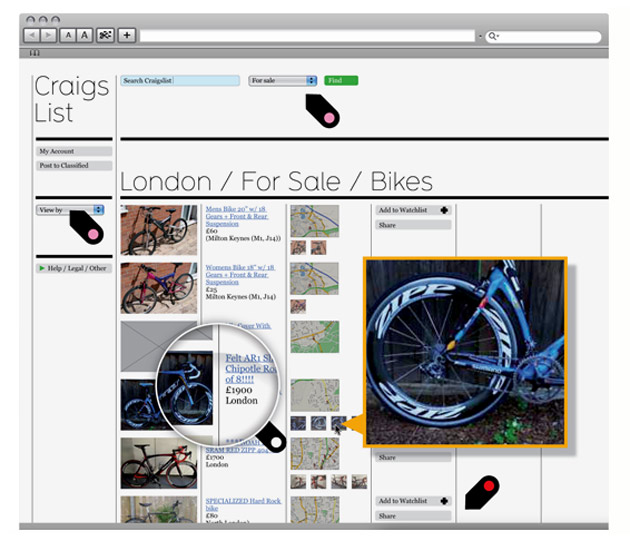
2. If you've never posted to Craigslist, don't try to redesign it. Anyone who's posted with an image knows that no such "product zoom" would be possible because of how CL transforms uploaded images to a suitably small file size.
Craigslist is a paragon of usable design, and you don't want someone who's critical of it for aesthetic reasons to be touching your website.
I got started in this industry as a web designer and I'm considering a move back. There are so many clowns who don't know a thing about usability and think that too much whitespace plus an anorexic serif equals quality.
The designs that change the layout make it less usable by preventing you from seeing everything it has to offer on one spectacularly ugly, usable page.
The design that kept mostly everything the same but modernized the colors, fonts and spacing is still worse that the current site: the current site has an effect of the design dissappearing behind the content, and the redesign has the colors and highlights push past the links and draw my attention away.